If you’ve ever left a conference feeling confused about where to go or like you barely had time to connect with anyone, chances are the floor plan had something to do with it.
The layout of your event space shapes everything from how attendees engage and how energized (or exhausted) people feel by the end of the day. Yet it’s often treated like an afterthought.
For years, event teams have focused on floor plans that prioritize efficiency above all else. Pack the chairs in. Maximize square footage. Minimize walking.
But here’s the shift: today's most impactful conferences prioritize experience first and then design layouts that support that goal.
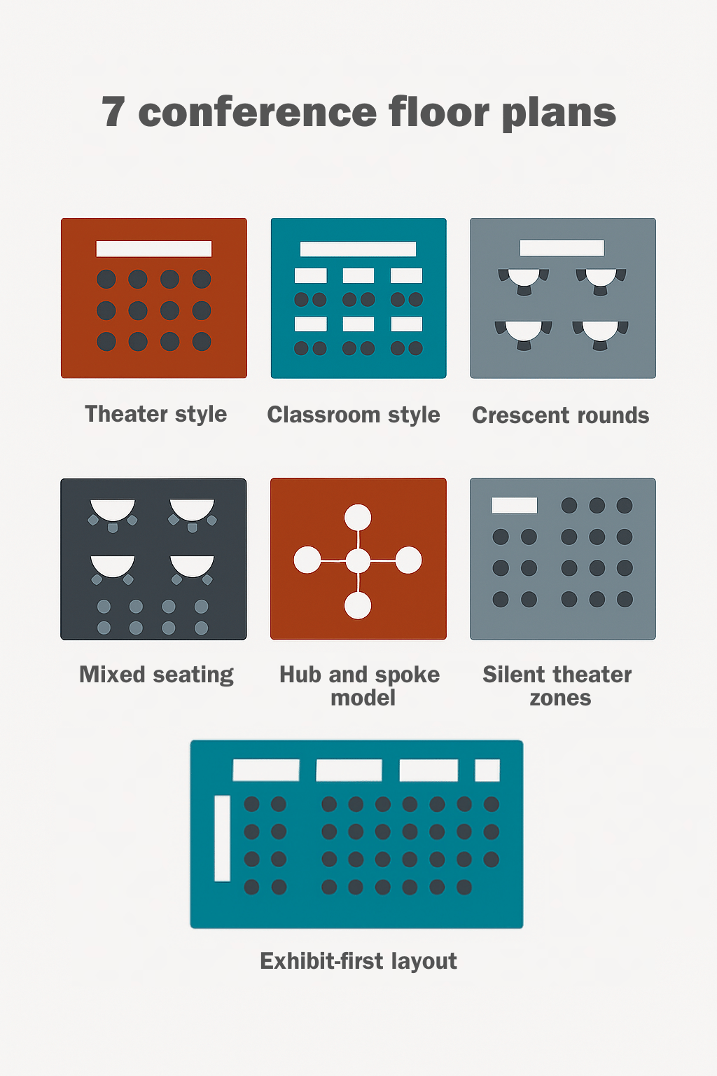
Quick summary.
How do you decide what floor layout works best for your conference? Let’s walk through seven floor plan styles and cover what each setup looks like, what kind of experience it supports, and where it might fall short.
Here’s what we’ll break down in this article:
- Theater style
- Classroom style
- Crescent rounds
- Mixed seating
- Hub and spoke model
- Exhibit-first layout
- Silent theater zones
Let’s take a look at which one best fits your event goals.
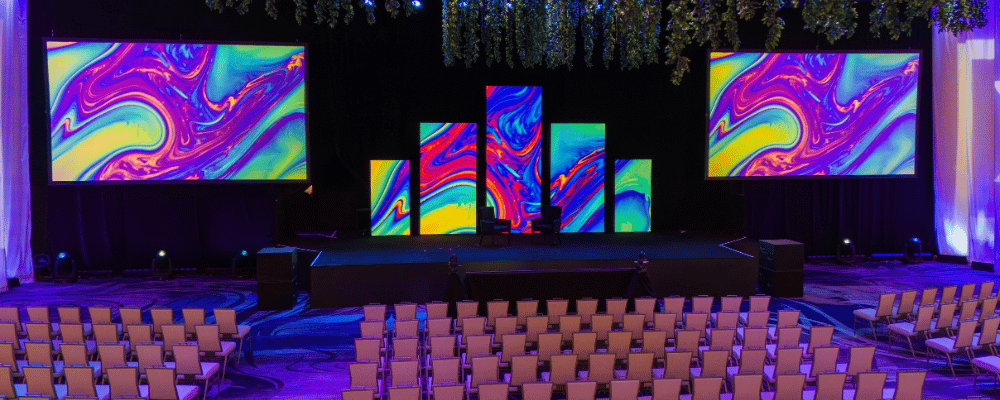
1. Theater Style
What it is: Rows of chairs all facing a stage or presentation area.
Best for: Keynotes, general sessions, large audiences where engagement is mostly one-way.
Pros:
- Maximizes capacity
- Clear sightlines to the stage
- Simple and fast to set up
Cons:
- No surfaces for note-taking
- Limited interaction among attendees
- Not great for longer sessions (comfort-wise)
When to use: You’re kicking off a big general session or hosting a keynote that everyone needs to attend and focus on. But if you're doing any sort of discussion or collaborative work, this isn’t the best choice.
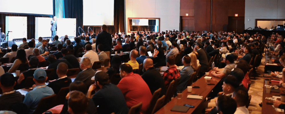
2. Classroom Style
What it is: Rows of tables with chairs, all facing forward.
Best for: Training sessions, workshops, or any content-heavy breakout where attendees need to take notes.
Pros:
- Tables allow for materials, laptops, and water
- Encourages attentiveness
- Good for long-form content or certification programs
Cons:
- Takes up more space
- Less interactive
- Can feel rigid or academic
When to use: When your audience needs to sit still and absorb a lot of information. This style is great for compliance training, deep-dive sessions, or anything with workbooks.
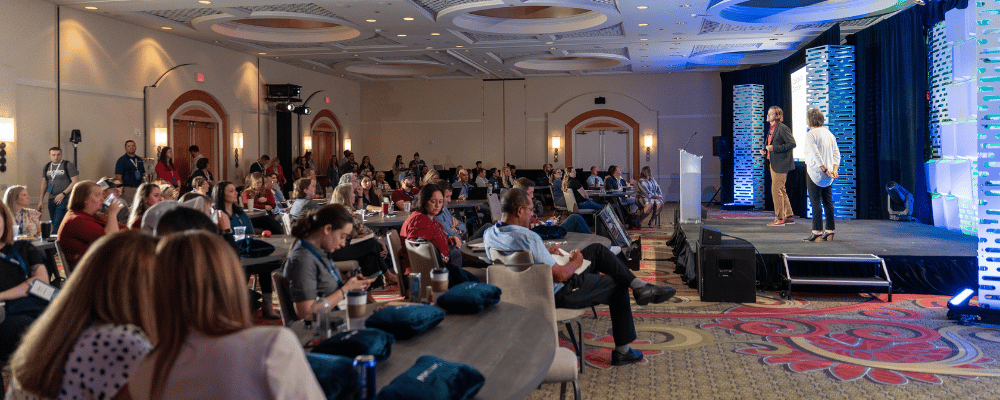
3. Crescent Rounds
What it is: Round tables with chairs on half or three-quarters of the circle, all facing forward.
Best for: General sessions with group discussion, interactive breakouts.
Pros:
- Allows for group interaction (if you make sure you don't put seats on one side of the table)
- Keeps everyone facing the stage
- More comfortable and dynamic than rows
- Could also make for easy transition to meals
Cons:
- Lower capacity per room
- Can be tricky with A/V sightlines if not set properly
When to use: You want energy and interaction, but still need attendees focused on a speaker.
4. Mixed Seating
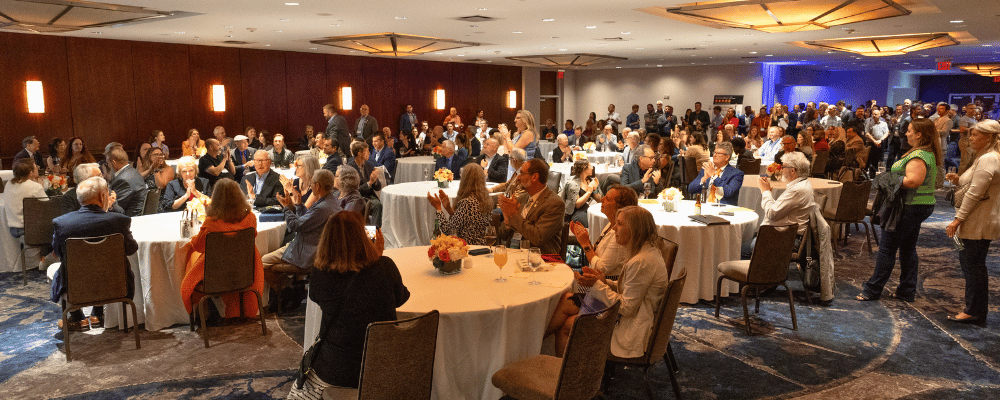
What it is: A variety of seating options (lounge furniture, highboys, stools, and standard chairs) all in one space.
Best for: General sessions or networking spaces where you want attendees to have options.
Pros:
- Gives attendees autonomy and comfort
- Feels modern and engaging
- Encourages casual interaction
Cons:
- Harder to plan and balance the room
- May feel disjointed if not curated intentionally
When to use: You want to create a welcoming environment that feels more like a living room than a lecture hall. Also great when attendees want the flexibility to come and go as they please.

5. Hub and Spoke Model
What it is: A central hub area with breakout rooms or experiences branching off.
Best for: Events that need a strong sense of community or a home base.
Pros:
- Creates a "town square" vibe
- Central location for sponsor booths, networking, and lounges
- Supports flexible use of space
Cons:
- Needs careful planning to avoid congestion
- May require more square footage
When to use: If you want to anchor your attendees and keep the energy focused, this layout supports movement while creating a sense of unity.
6. Exhibit-First Layout
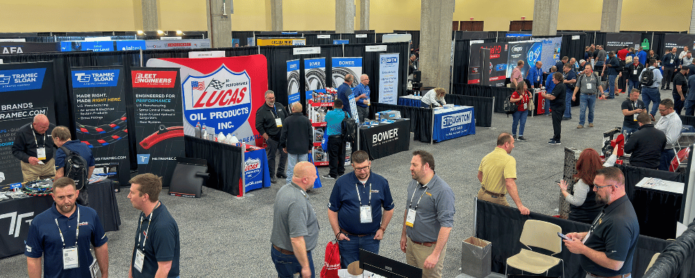
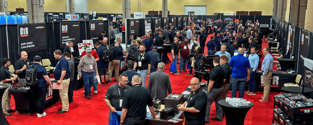
What it is: Design your flow around an expo or sponsor hall first, then add sessions and breakouts around it.
Best for: Conferences where vendors or sponsors are a major part of the experience.
Pros:
- High traffic to sponsor booths
- Easy way to layer in engagement
- Natural opportunities for networking
Cons:
- Risks of being noisy or chaotic
- Can overwhelm attendees if poorly spaced
When to use: When sponsors are key stakeholders, and you want to prioritize exposure.
7. Silent Theater Zones
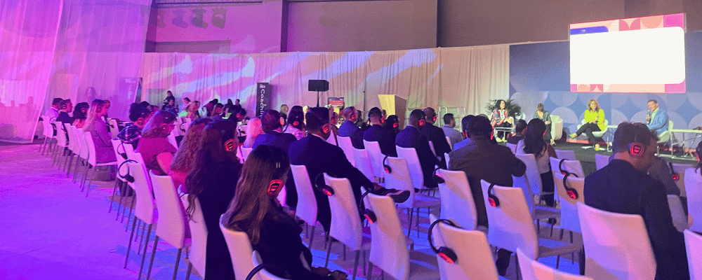
What it is: Several small stages or "theaters" in a shared space using headsets.
Best for: Exhibits, breakout tracks, or shorter content formats.
Pros:
- Creative use of space
- Flexible and engaging
- Great for cross-functional zones
Cons:
- Can feel gimmicky if not executed well
- Relies heavily on tech working perfectly
When to use: You want flexibility in an open-concept space. Also, a great alternative to traditional breakouts.
Floor plans for enterprise-scale events.
At 1,000 or more attendees, a floor plan has to satisfy fire code, keep a general session watchable from the back row, work for a hybrid broadcast, and move a crowd through a sponsor hall without creating a bottleneck.
Fire code and egress.
NFPA 101 sets the space per person figures most venues design against: about 30 net square feet per person for a standard exhibit floor, 15 square feet per person for concentrated seated areas, and 7 square feet per person for standing room zones. Egress width has its own math, roughly 0.2 inches of aggregate exit width per person for doors, corridors, and aisles, so a 1,000 person room needs about 200 inches, roughly 17 feet, of exit width spread across all exits, and a 5,000 person hall needs closer to 83 feet. Travel distance to an exit is capped too, 250 feet in sprinklered venues and 200 feet in unsprinklered ones. Theater style and exhibit first layouts hit these limits first simply because they pack in the most people per square foot; hub and spoke and crescent rounds have more built in breathing room.
AV sightlines for large theater setups.
For an 800 seat general session, the room needs to hold a workable "C value," the vertical clearance between one attendee's eyeline and the head of the person in front of them, consistently from the front row to the back. Riser height between rows typically maxes out around 21 inches, with 18 inches or less preferred to avoid discomfort; rather than vary every row, the common approach is grouping several rows at one riser height near the front and increasing it in steps further back. On a flat conference floor without stadium style risers, sightlines to the stage and screen tend to degrade past roughly 15 to 20 rows, which is why large general sessions add riser platforms or lean harder on IMAG screens the deeper the room gets. This is closely tied to overall AV planning; see how to elevate your conference AV production for more on getting this right.
Hybrid camera placement.
A hybrid general session needs a minimum of two cameras: a wide shot for context and a tighter shot for the speaker. The wide camera needs an unobstructed line from the back of the room to the stage, which is a lot easier to get in theater style or classroom style seating with a clear center aisle than in crescent rounds or hub and spoke layouts, where round tables, centerpieces, and clustered seating sit directly in that sightline. If hybrid is a requirement, the layout choice should be made with the camera position in mind from the beginning of room set up.
Sponsor booth traffic flow in large expo halls.
Primary aisles need to be at least 10 feet wide for shows under 3,000 attendees on the floor at once, and 12 to 15 feet for higher density shows; secondary aisles can run 8 to 10 feet. Island booths need 10 feet of clear aisle on all four sides. Counterintuitively, the biggest sponsor usually should not sit right at the entrance, since that traffic was coming anyway regardless; placing anchor exhibitors deeper into the hall pulls attendees further into the space. The real traffic arteries are the paths between the hall entrance and wherever attendees are headed next: general sessions, breakouts, food, restrooms. Pinch points show up predictably at entrance transitions, aisle intersections near island booths, and anywhere an aisle narrows. A floor density of 15 to 20 square feet per person reads as lively; under 10 feels crowded, over 40 feels empty.
GoGather saw this play out firsthand managing an annual kickoff and supplier expo for over 1,000 attendees at the Gaylord Texan Resort in Dallas, where more than 100 supplier booths had to share the floor with a packed multi-day agenda. The team used strategic room blocking to manage how attendees moved between sessions and the expo floor, keeping the supplier summit distinct from the general expo hall footprint.
For more on booth design itself, see 6 ways to make your expo booth stand out.
How your venue impacts layout possibilities.
Your floor plan only works if your venue supports it. While it can be tempting to default to properties with all the bells and whistles, it’s important to ask if the venue actually fits your experience, not only your headcount.
If your sessions are tucked between other major conventions or you're sharing spaces with unrelated groups, you risk losing control of the attendee experience. Look for:
- Spaces that fit your flow and not only headcount
- Flexibility to reconfigure spaces as needed
- Opportunities to use nontraditional areas (think rooftops, foyers, outdoor lounges)
A smart venue choice gives you room to think creatively and build something that supports your attendees’ journey from start to finish.
Related: the best corporate event planning site visit checklist.
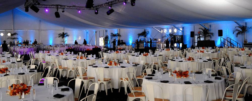
Common floor plan mistakes (and how to avoid them).
- Designing for efficiency instead of experience: Maxing out headcount isn’t the goal. Prioritize what you want your attendees to feel.
- Accepting the default setup: Don’t go with what the last group did. Ask yourself why it’s set that way, and if it actually supports your objectives.
- Ignoring who you’re sharing space with: If another group is hosting a massive production next door, your event may suffer by comparison.
- Underestimating transitions: If it takes 15 minutes to get from a general session to a breakout, you need to build that into your agenda. Layout and schedule are tightly linked.
- Not designing for downtime: Give people somewhere to go when they’re not in a session. Whether it’s a lounge, a hub, or a charging station, you want to keep them engaged.
- Assuming a layout that worked at 300 people will still work at 1,000+: Aisle width, egress, and sightlines that work at a smaller event can fail as headcount grows.
Are you tasked with organizing your company's next corporate event? Here are the top 10 event planning challenges and how to overcome them.

What’s trending in floor plan design?
✅ Community Hubs: These are central, flexible spaces where attendees return between sessions. Call it a hub, lounge, or hospitality suite. They give people a sense of place and promote spontaneous connection.
✅ Mixed-Use Zones: A lounge that becomes a theater. A dining space that doubles as a demo area. It’s all about efficiency and experience.
✅ Silent Theaters: Ideal for open-floor breakouts or innovation sessions. They keep energy up without noise overload.
✅ Sponsor Integration: Rather than a separate hall, brands show up along the natural path. These are similar to activations in transition areas or networking lounges.
Curious what else is trending? Here are 8 corporate event trends and conference themes to watch out for.
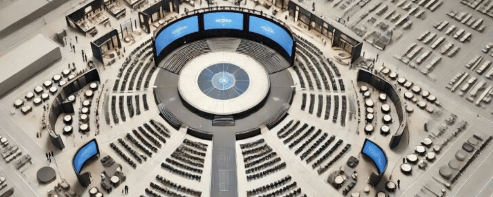
Using AI to brainstorm your layout.
Need a starting point? Let AI help you build your first layout draft. Tools now exist to generate 2D or 3D mockups of your event layout based on:
- Objectives (networking vs. learning vs. brand exposure)
- Venue specs
- Number of attendees
AI can also analyze previous event data to help you determine what worked (and what didn’t). You can even prompt AI to simulate traffic flow based on your layout idea, or to recommend how to spread out sponsor activations without clogging key walkways.
Using tools like ChatGPT, Gemini, or Canva whiteboard early on helps you visualize what’s possible before you ever set foot in the space.
Related: 6 interesting ways to incorporate AI into your next event.
Conclusion.
Don’t default to standard layouts. Let your goals lead, get curious about what’s possible, and use the tools (and spaces) available to create something that works for your event attendees, not against them.
And when in doubt? Ask yourself: Does this layout reflect the kind of experience I want people to have at my event?
Need help creating your next floor plan?
Our project management team brings decades of experience to the table, helping clients create events that stick with attendees long after they’re over. From big-picture ideas to the final details, we’ve got it covered. Ready to chat about your next event?